Is there a way to modify highlight UI in Space Center?
-
Thanks, as always, for making and continuing to improve my favorite type design software!
After thinking of this about 1000 times, I figured I should post something...
A very frequent little problem I face: while I’m in the Space Center, trying to judge how spacing looks, the selected glyph always gets a background highlight, which disrupts my view of how its spacing actually looks.
I’ve adjusting my settings so that this highlight is as ignorable as possible while still making it clear what is selected. However, I can never really relax and really look at the spacing, because that background is tainting the color of the spacing.
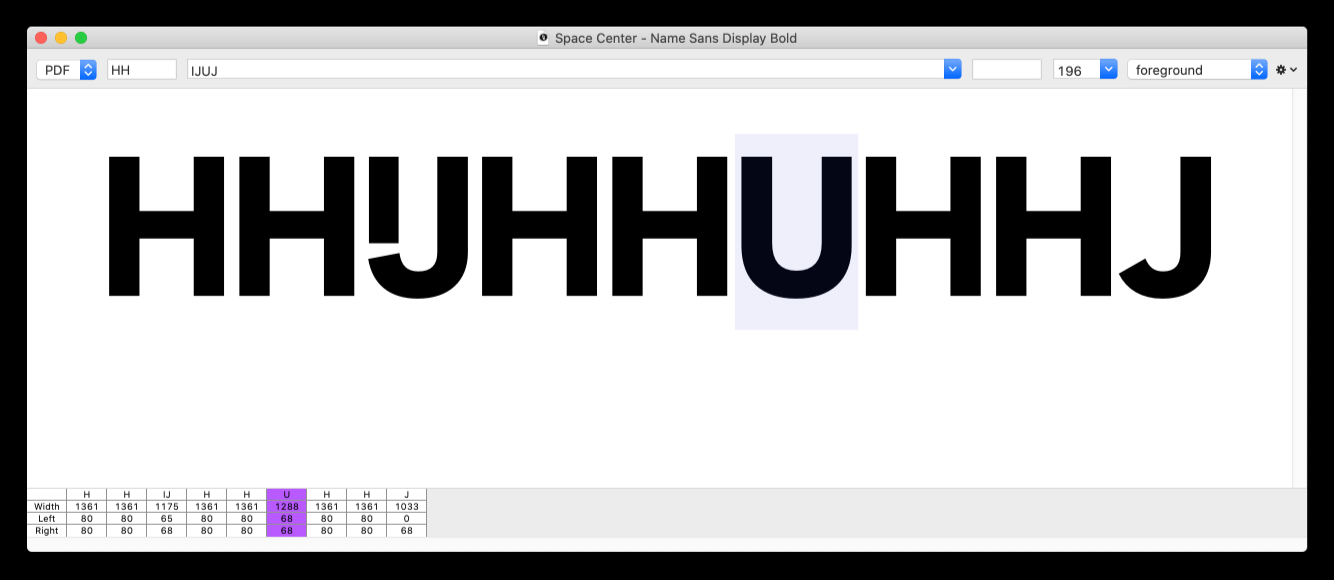
To workaround this, I have to do something like adding that glyph again at the end of the string, then selecting and adjusting it there, but looking at it in the first spot ... which is pretty cumbersome to be a realistic workflow.
What I would love would be an alternate way to highlight the selected glyph, without disrupting its sidebearings. The most obvious way I can think of for this would be an underline with a user-configurable color. With this, the selected glyph would still be extremely apparent, without adding any friction to the spacing process.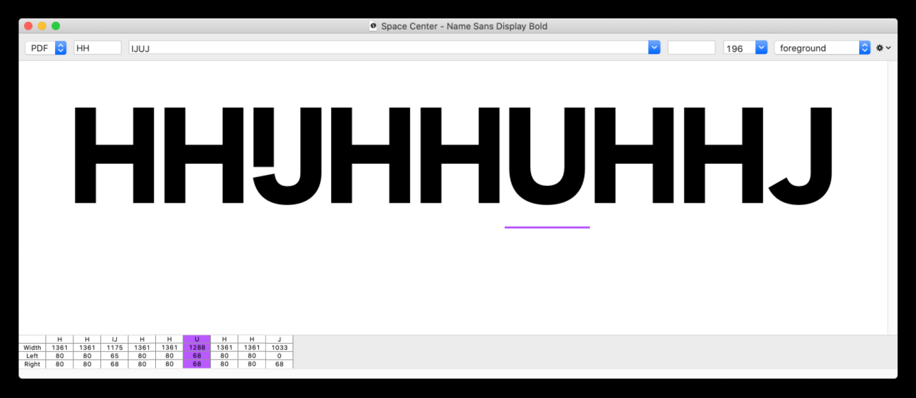
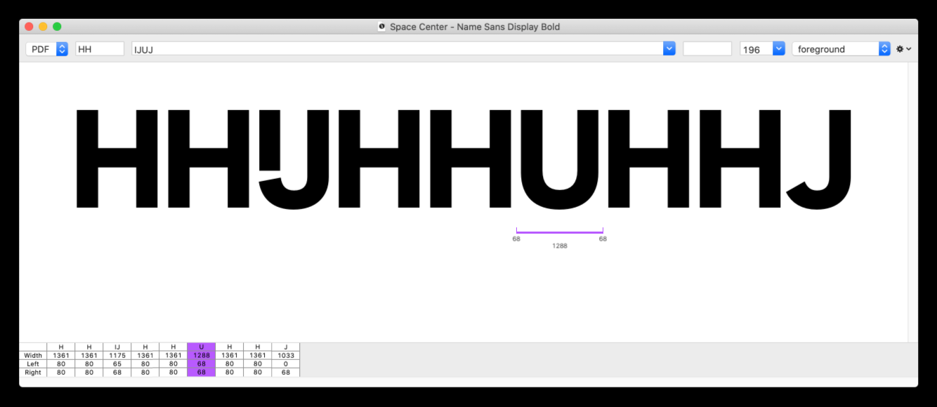
Perhaps one step better would be to have the option to see metrics for the selected glyph:
So, I guess the point/question of this post is two parts:
- A feature suggestion – please consider this tweak in a future version!
- A question: how difficult would it be to script a custom Space Center UI with an altered visualization for the glyph highlight?
I know you probably have a big backlog of things you’d like to improve, so I don’t expect this to happen anytime soon. But, if it could ever happen, I think it would be a small but very meaningful upgrade to the Space Center!
-
Interesting solution!!!
-
@frederik thanks, that’s where I learned about /! ;)
@ArrowType I don’t know about everything Else, but at least the /! is around for quite a while already :)
-
Woah, I learned a few new things about the Space Center by looking at that reference page! Didn’t know the
/!trick, or the⌥ + Escapelist view, or that I could click and drag glyphs within the space center. Was that all there in RF3, or is any of this new?Also, thanks @Ryan! This is an interesting script, and could almost do what I’m hoping for.
-
@ddaanniiieeelll see all space center input options
https://robofont.com/documentation/reference/workspace/space-center/#text-input-fields
-
An underline like in MetricsMachine would be fantastic!
Until then my workaround was
• setting the space center and the type to a specific size
• Use a saved spacing string likeHH/?HH\n OO/?OO\n HH/?HHStacking the strings like that makes it easier for me to space the letter in the third row while looking at the two rows above it.
This might not be suitable for every situation, but I get the most of my spacing done like this :)Also: it took me a while to find out that /! displays the current selected glyphs in the Font Overview vs /? displaying the currently active glyph.
With /! I have the font overview next to the space center and can click through the glyphs, that actually did wonders for my workflow :)
-
@ArrowType This seems interesting and relevant https://robofont.com/documentation/how-tos/observers/custom-space-center-preview/
-
and the selection color can bet set with
Selection Highlight Color.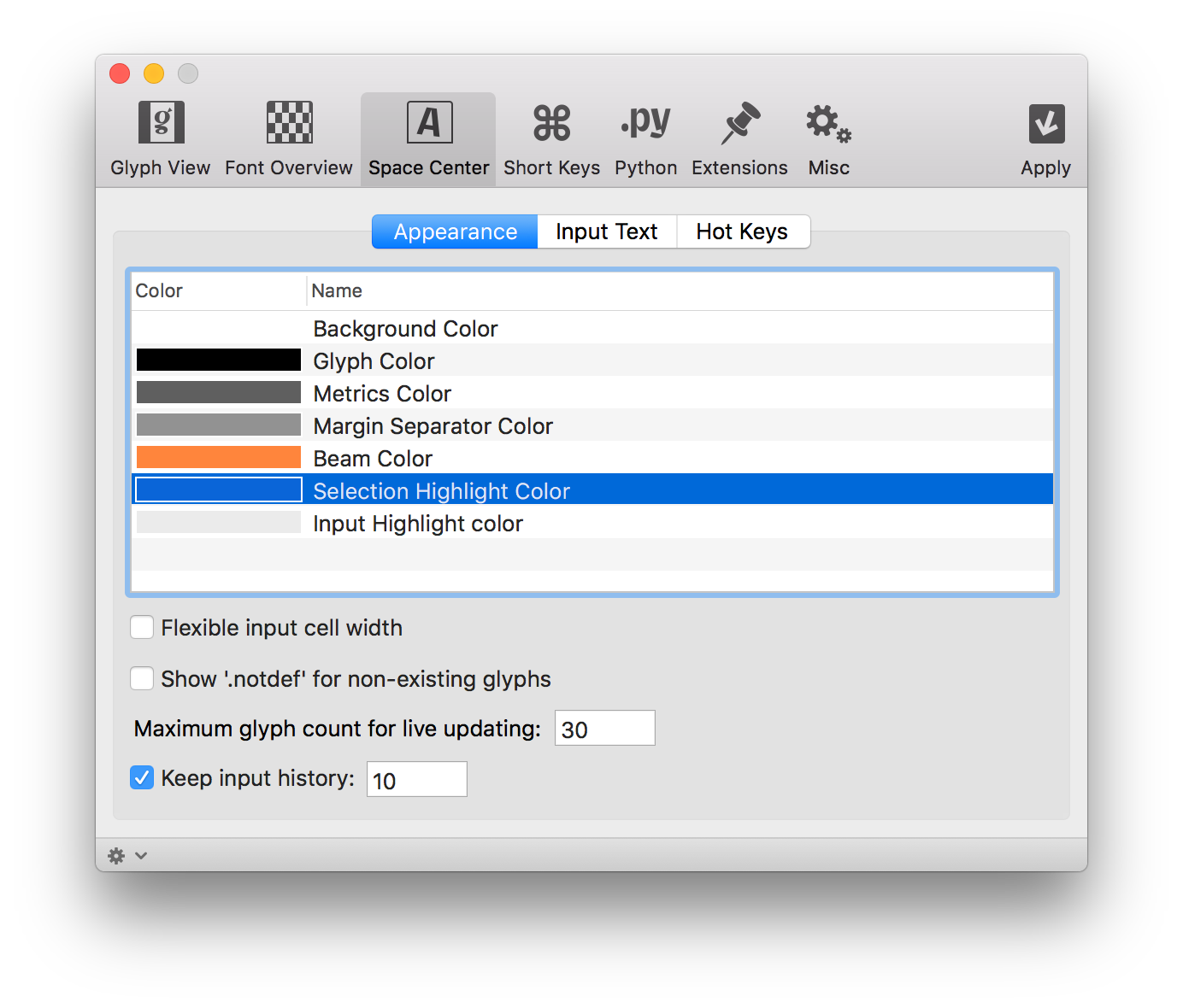
-
and there is a there is this show metrics display options in a space center, but an option inbetween could be nice: only show margins on selection
-
added to the todo list. This selection box could give a wrong impression on spacing.
thanks!