UNSOLVED How to edit color of selected glyph in Font View with version 3.4
-
I love that I can now edit the Font View to get a true dark mode!
However, there’s one part I haven't been able to figure out:
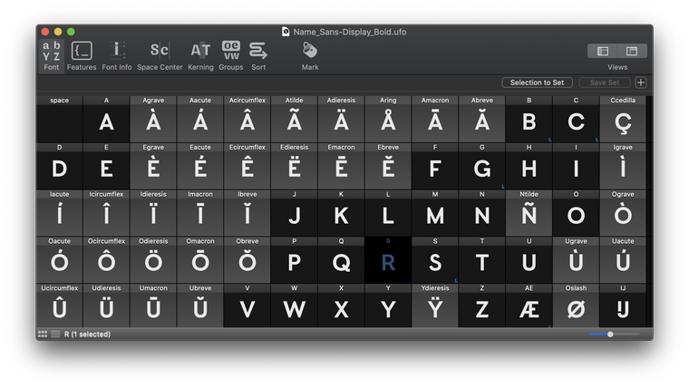
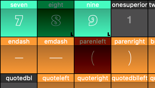
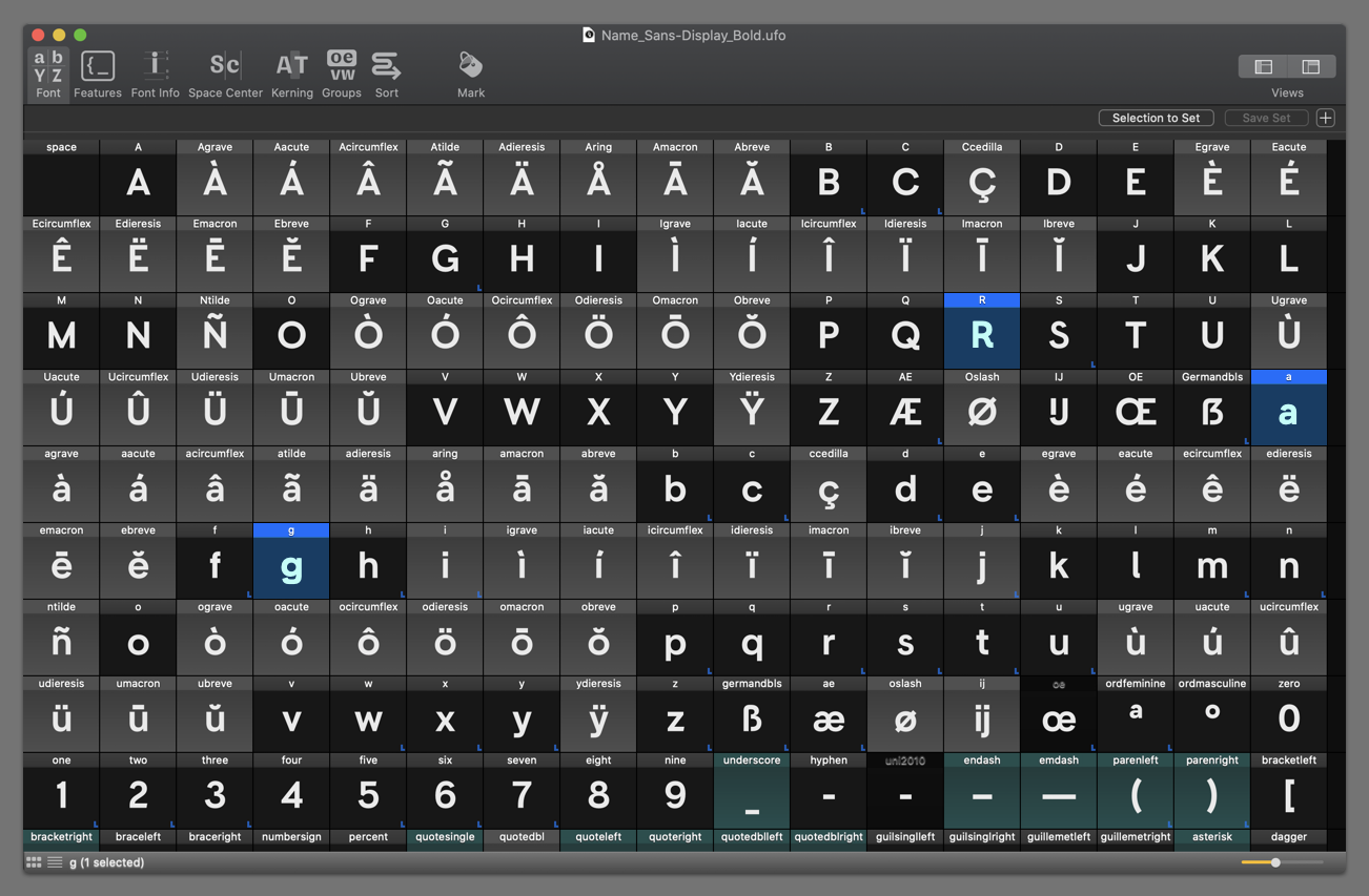
How can I edit the color / highlight of selected glyphs in the Font View? For example, the letter "R" is selected in the image below. Instead of it gaining a partially-transparent blue overlay, I would like to do something like make the selected glyph color bright blue, and the background navy blue.
Thanks for continuing to improve this software! I really am happy about this update. :)
-
Thanks, @frederik. I understand that, and I believe that it is not the best possible way to display this information, as evidenced by the screenshots in this thread.
Specific options for selected background/foreground colors would be helpful, as I suggested above.
I really appreciate the big advance you've given the app in the recent option updates! It makes a really big difference in the comfort of using RF in the evening. This is just one area that I believe still requires a little extra advancement to make the "dark mode" mode complete.
Thank you!
-
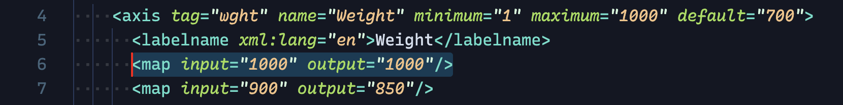
The selection color in a glyph cell view is based on the macOS control selection color. see https://github.com/robotools/defconAppKit/blob/master/Lib/defconAppKit/controls/glyphCellView.py#L152
selectionColorcould be added to the prefs.
-
I've encountered the same issue(s) while trying to create a dark mode appearance for the Font Overview and I agree with @ArrowType suggestions.
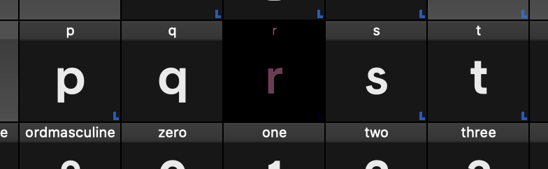
But I also noticed that somehow a selected glyph is much darker when in dark mode, which is the main issue. Even when changing the inherited color to basically white it’s still really dark.
Light mode:
Dark mode:
Is there any way I could change that?
Edit: Also as a suggestion maybe the selection could be a simple outline around the glyph.
Edit2:
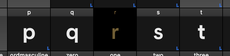
Actually the behavior of the selection in dark mode is even weirder than I thought…
Light mode:
Dark mode:
-
the selection color is inherited from your macOS preferences (General > Highlight color).
Ahh, that makes sense now; thanks for helping point that out!
I suppose this is a feature request instead of a question, then.
I would love it if RoboFont added preferences for:
- the background of selected glyphs
- the text color of selected glyphs
- the header color of selected glyphs
- the header text color of selected glyphs
And possibly:
- The highlight color of selected glyphs (placing this above the regular highlight, or perhaps not using the system highlight as it is currently used)
The first background options would allow a workaround like making selected glyphs essentially have a "light theme" that would again work with the default highlights, though with the tradeoff that selected glyphs would have to be "inverted" (light background, dark glyph) for it to work. If the fifth option were added, this could deliver the best overall result.
The macOS default highlight is fine as a default in a light UI, but on dark backgrounds such as the screenshot above, using the system default makes selected letters suddenly very difficult to read. Even if I change this to something "lighter" like yellow or magenta, the result has low legibility:
In other apps like code editors, highlighted text options are an important part of theming, partly because the selected state is such an important aspect of the user experience and the overall appearance of a theme.
Ultimately, I'd love to do something like the mockup below, where selected glyphs (R, a, g) had a nice blue cell and maybe a teal highlight, or something similarly dark overall but highly-visible. Of course, others would have different preferences and prefer purple/pink/orange/whatever other highlight colors.
-
hello @ArrowType,
the selection color is inherited from your macOS preferences (General > Highlight color).
cheers!